This website uses cookies so that we can provide you with the best user experience possible. Cookie information is stored in your browser and performs functions such as recognising you when you return to our website and helping our team to understand which sections of the website you find most interesting and useful.
Search Products
About Us
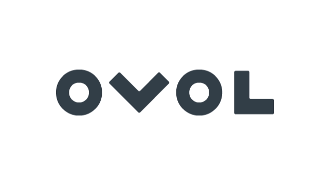
The Meaning Behind the Brand Logo


The two Os in the OVOL logo symbolise the global expansion of the Japan Pulp & Paper Group. The shape of the striking logo is not only reminiscent of a celestial orbit and ovals, but the repetition within the letter O represents a smooth and never ending continuity, nature and familiarity, as well as the direction of the Japan Pulp & Paper Group in its global expansion, and these are conveyed in a unique way that is both visual and almost aural. The letters of the logo include the word “VOL”, which conveys an image of flying in languages with a Latin origin such as French, and the four letters of “OVOL” represent both “the power to fly into the future” and the possibilities of a story’s new beginning.

WHAT THE BRAND COLOUR SYMBOLISES
The grey used as the brand colour has a high affinity with other colours and is also a harmonizing color that enhances any surrounding colours. As grey is a blend of all colours, it represents the cooperative ability to bring out the best in, and bring together, others. Grey also symbolises the way of the Japan Pulp & Paper Group, which transcends time and is sought out for its significance.